The inkle blog
Get EXPELLED! today!
Our new game, EXPELLED!, launches on iOS, Switch, and PC and Mac today!
You play as Verity Amersham, a scholarship girl at a top boarding school in England, 1922.
A School Prefect has been pushed out of a window, and everyone's blaming you. You have one day to clear your name, find the true culprit - or find someone else to take the blame for you.
Building off 2021's Overboard!, Expelled! drops you into the shoes of your protagonist and lets you go. Explore anyway. Sneak around, steal, lie, blackmail, befriend -- approach things however you want.
But be warned: the other characters have feelings, opinions and memories, and they're watching you right back. This is a detective game - but it's also a living, breathing world.
Meet the characters
Verity Amersham

Verity was born in a factory town in the North of England, but she dreams of being an actress in the West End. If she's kicked out of school that dream will die - especially when she's innocent. Time, then, to stop at nothing.
Natasha Vronskaya

Nattie is Verity's roommate, a Russian with a dark and mysterious past. She definitely has something hidden in her slippers - but otherwise, she's loyal to a fault. She'll stick up for you, won't she?
Fifi Vaudeville

Fifi is Verity's nemesis - after all, who ever heard of a Sixth Former losing the lead role in the school play to a Fourth Former?
Louisa Hardcastle

Louisa is on track to be Head Girl - not from academic prowess, but from her skill on the hockey field. But now she's fallen out of a window, will she ever play hockey again?
![]()
Get Expelled! today on...

Coming Soon: Miss Mulligatawney's School for Promising Girls
Announced today -- a bold new venture for inkle studios: a girl's boarding school, opening soon in 1922.
Created using a combination of ink script and time travel, we're pleased to announce that the school will be opening its doors a hundred years ago to teach the very best in Latin, Mathematics and Field Sports to Britain's finest girls.
![]()
There is also one scholarship place available. You can apply now via Steam though when the school eventually opens, application forms will be available via a variety of digital storefronts.
The prospectus
The best way to get a sense of what Miss Mulligatawney's School will have to offer is to browse the prospectus, which we've digitally scanned and uploaded below.


Any questions?
Any questions or concerns you might have about the school and the safety and well-being of its students should be directed to the school secretary, Miss Lemon, who will be very happy to answer.
Please drop a comment below or contact us directly on Discord.
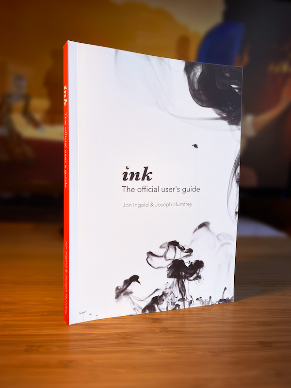
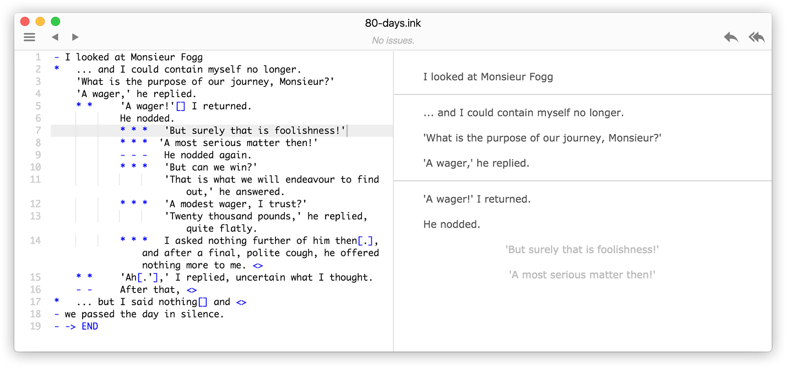
ink: the official user's guide, is out now!
Newly released via the inkle bookshop: the official user's guide to the ink scripting language.
Consisting of three parts, the guide covers everything from installing the software, to integrating it with Unity, through to using more complex patterns and tricks to push the limits of what's possible in your interactive stories.
Suitable for beginners, but with something to offer the expert, the official guide is the definitive companion to ink.
The guide
The guide has three parts: Writing with Ink, Running your Ink and Ink Patterns.
Writing with Ink is the manual contained within inky, which guides you from first principles, through to the more complex features of the language. The guide's version is up-to-date with the latest language features, and has been thoroughly revised with new examples.
Running your Ink is also revised from the free copy available with the ink repo: the new version contains additional sections on profiling your ink, managing save files between release versions of your game and localisation.
And the third part, Ink Patterns, is a new release that pulls together several tricks and ink structures we've developed over the years. Some of these have been previously released via Patreon and on Discord; but we've pulled them together and organised them into sections covering lists, loops, shuffling choices, decision-trees and more.
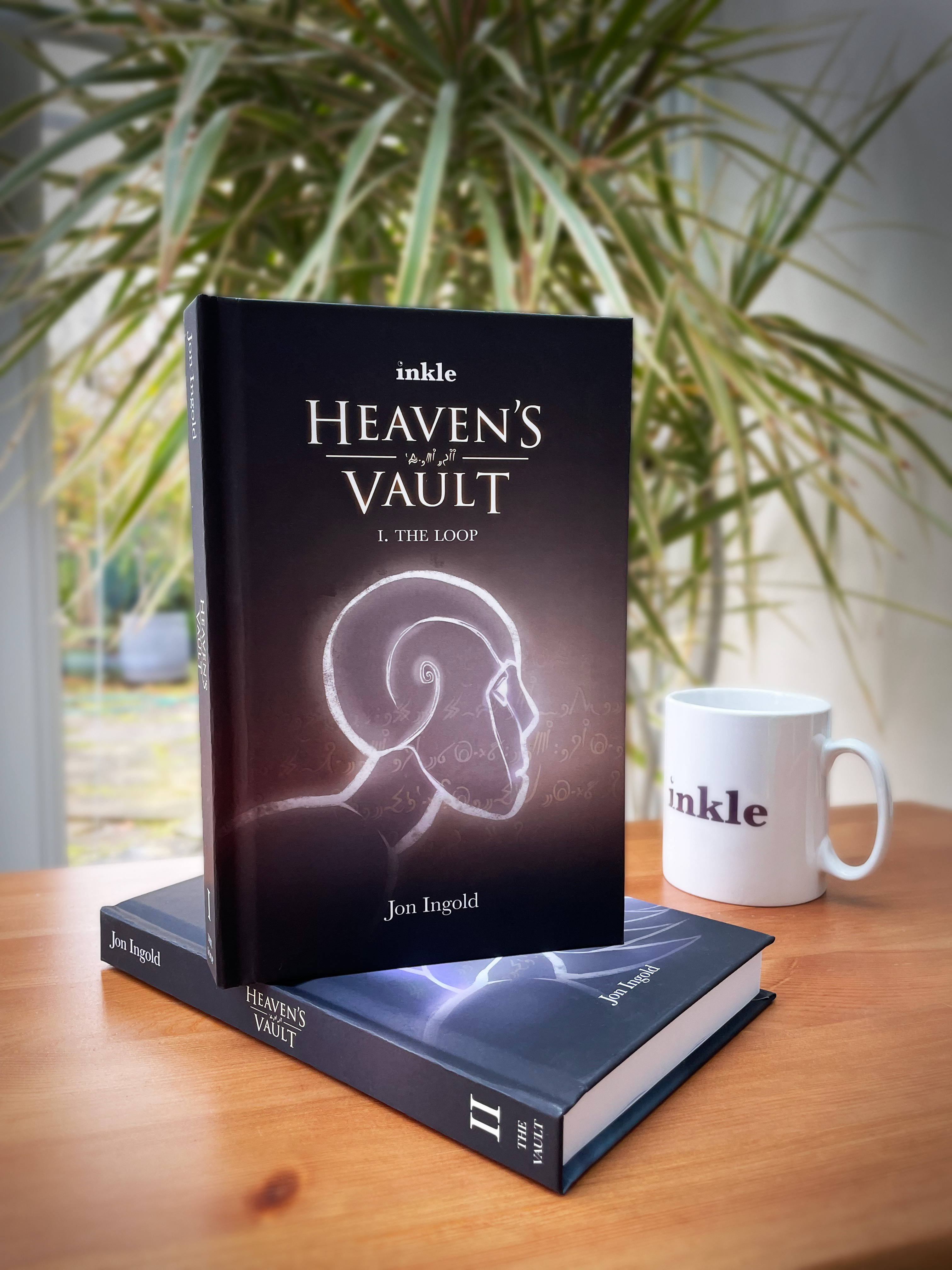
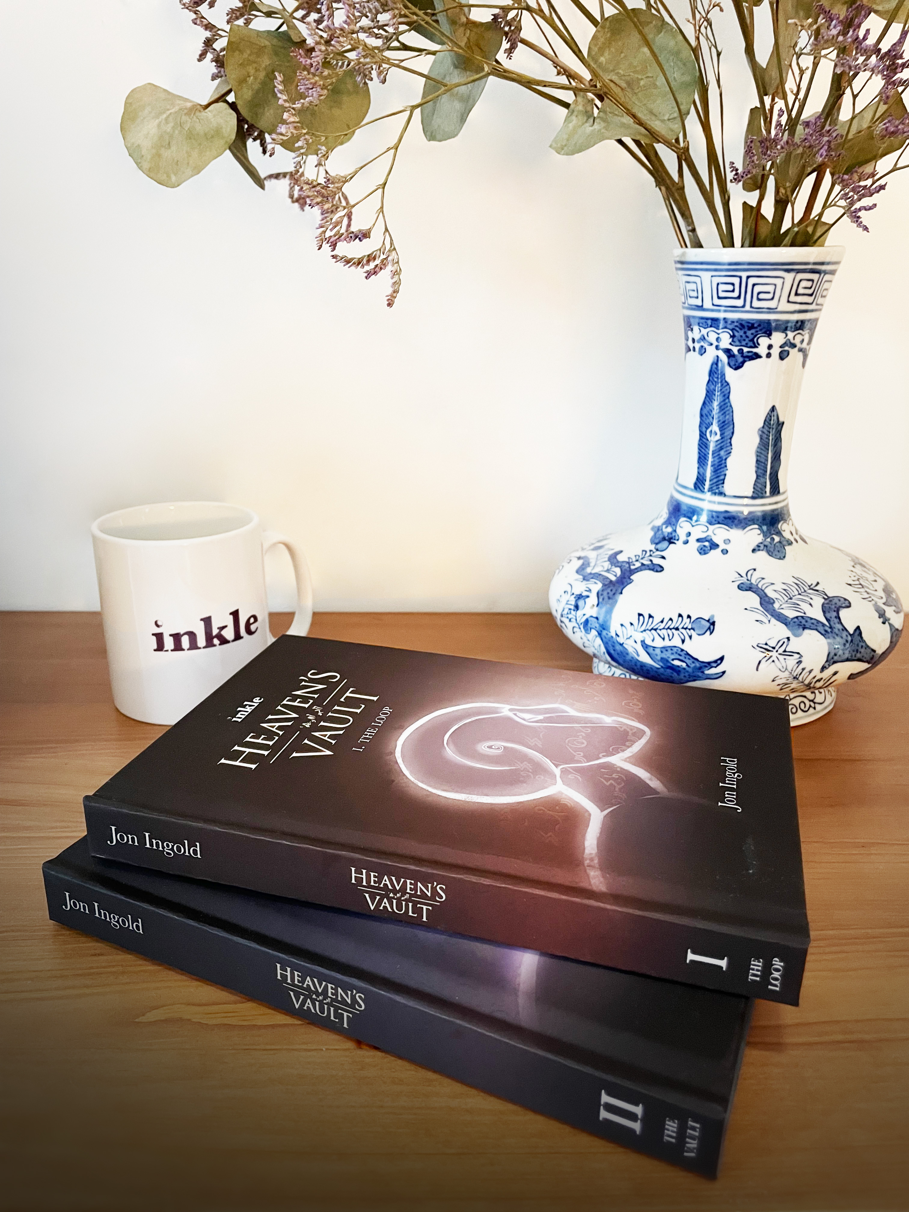
Heaven's Vault novels, out now!
When we released Heaven's Vault in 2019, it was the biggest storytelling task we'd ever undertaken - a whole world, with 4,000 years of history, and a language or two besides.
Since then, it's gone on to win awards and gain a loyal community of fans, writing in Ancient, creating new words, and piecing together the hidden corners of the Nebula's turbulent history.
And here at inkle we haven't been able to leave the Nebula behind either - which is why, last year, we began work on a collection of stories from the world of Heaven's Vault. That collection grew into a full novelisation of the game, that deepens, broadens, expands and develops the story of the game.
And it's out now:
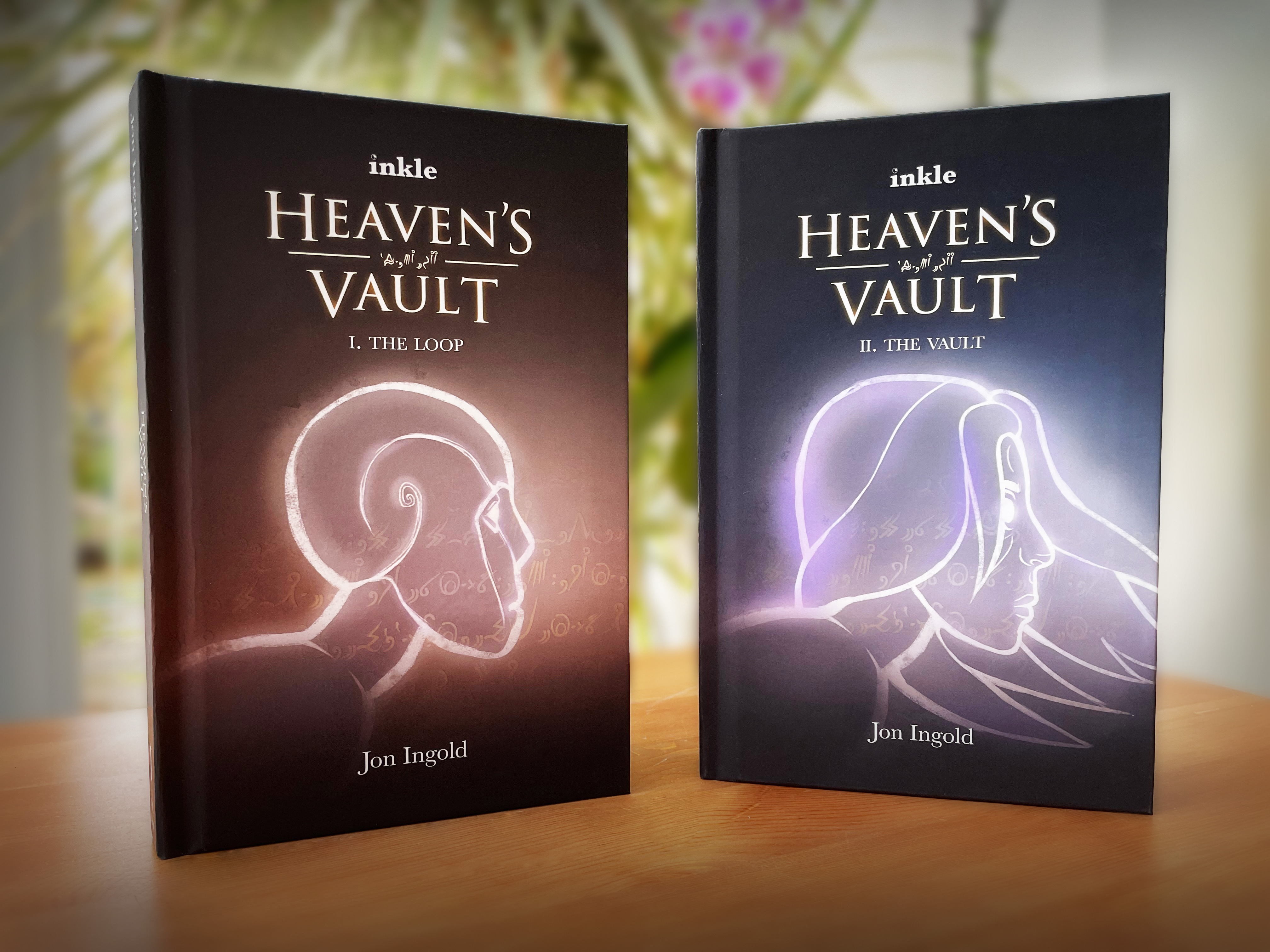
Two Books, One Story
Split across two 300 page volumes, the story follows Aliya Elasra from her first meeting with hew new robot Six to the rice fields of Maersi and into the wild waters of the Cyclones as they search for missing roboticist, Janniqi Renba, and stumble upon an ancient and dangerous secret that threatens the entire Nebula.
The books are written by the game's narrative designer and writer, Jon Ingold (hi!), and they contain new characters, new locations, new lore and new twists (as well as one full-page Ancient inscription per volume, for translation fans!) If you've played the game, there's plenty more here to enrich the experience.
But the books are also written to be read by people who have never played the game (or played any game!) The books provide a different way to enter and explore the world of the Nebula.
Out now, limited release
We've been sharing copies with fans over the last week, and enjoying the building excitement as people begin to explore this new take on the story. We're now opening the store for everyone - but it won't be open for ever: we're planning to limit the release for a few months.
For more information, check out the shop FAQs page - and if you read, let us know what you think.
Good faith!
ink version 1.0 release!
We're proud to announce that ink, our open-source scripting language for interactive narrative, has now officially reached version 1.0!

What's new in Version 1.0?
Version 1.0 is a stable release of "the story so far". The core features are well-tested and well-used, and the current integration has powered two full inkle releases: 2019's 3D adventure game, Heaven's Vault, and 2020's procedurally narrated tactics game, Pendragon.
But there's one big new feature: we've introduced the concept of parallel, shared-state story-flows - allowing the game to, say, switch between different simultaneous NPC conversations, while still allowing one conversation to affect the other.
We've also improved error handling and improved the way ink calls game-side functions. Inky now has a dark mode (see above!), zoom, a word count and stats menu, and better syntax highlighting. The default web player has new features for links and audio. And the Unity integration now allows live recompilation mid-game.
Full details can be found on the release notes page for ink, Inky and the ink-Unity-integration plugin.
What is ink?
ink is designed from the ground up to be "Word for interactive fiction". Open it up, and start writing. Branch when you need to, rejoin the flow seamlessly, track state and vary what's written based on what came before - without any need to plan, layout, or structure in advance. Organise your content when you know what shape it wants to take, not before.
It was recently awarded an Epic Megagrant, and we're otherwise supported by a Patreon.
![]()
A Different Approach To Interactive Writing
ink takes a different approach from other interactive fiction writing software in several ways.
It's entirely script-based, with no diagrams or flow-charts. Instead of being optimised for loops, it allows writers to quickly and robustly create heavily branching flow that runs naturally from beginning to end - as most interactive stories do.
All code and technical information is added as mark-up on top of text, making it easy to scan, proof-read, redraft and edit. It's also easy to see what's been changed in a file when using source-control.
Another key concept is global, always-on state tracking: every line the player sees in the course of the game is remembered, automatically, by the engine, without the need to define variables. This allows for fast iteration on game-logic and the easy implementation of cause-and-effect, without the need for "boilerplate" code.
Flexible and Powerful
But that doesn't mean ink is limited: it has variables, functions, maths and logic should you need them, and can also hand off complex decision-making to the game-code itself.
ink is also deliberately layout-agnostic. By handing the UI over to the game, it can be used to make hyperlink games, visual novels, RPGs, chatbots, FMV games, or simply to deliver highly-responsive barks in an first-person action game.
Over on the engine side, ink comes with a run-time debugger that allows reading and poking of variable state, and a profiling tool to help developers in frame-rate dependent environments to find and fix story-side slowdowns.
Uptake
ink has been adopted by game studios and other developers all around the world. It's been used on big indie games such Haven, NeoCab, Over the Alps, Falcon Age, Signs of the Sojourner and others.
For people looking to learn more about using ink, we've got several talks on our approaches, including this on from GDC 2017 on how Heaven's Vault drives its 3D world from a text-based script:
Development History
Here at inkle, ink has been our bedrock. We've used ink on every single title we've released over the last ten years, expanding and developing the feature set of the language over that time from quick mark-up for authoring branching choice-based narratives (Sorcery!) to authoring open-world, responsive, go-anywhere-and-do-anything narratives (er, Sorcery! 3. Also, Heaven's Vault.)
And we're continuing to find new ways to use the engine, like last year's experiment in procedurally narrating a chess-like game.
Originally released as an open source beta in 2016, ink quickly accrued an editor, inky, for easily writing and testing content, and a dedicated Unity plug-in to assist with integrating and testing stories at run-time.
Community Development
Since its release, a wide community of developers and enthusiasts have contributed to the project. There is a full javascript port, built into inky, which allows the editor to produce stand-alone web-playable games. There is a port for the popular Godot engine, and work is progressing on a C port that will ultimately enable Unreal integration.
We've had contributions in the form of bug fixes and features requests to the main ink code base, and too many contributions to ink to list - from Dark Mode, through auto-complete, to an integrated version of the "Writing With Ink" documentation and, most recently, an "open recent project" menu listing.
Looking back, we think these developments have justified our decision to make ink fully free and open source: the development around the system that's taken place would never have happened without the efforts of other developers, and we'd like to take this opportunity to thank everyone who's offered contributions, both large and small, over the last five years.
The core meeting point for ink developers has been the inkle Discord, which is now the go-to place on the internet for assistance with implementing ink features, and contains a wealth of tips and ideas.
Looking forward!
As inkle continues to develop games, we're continuing to develop and extend both ink and the Unity integration to allow us to tackle new problems.
Though we're naturally more cautious with new languages features now the codebase is mature, we have an internal roadmap of issues and features we'd like to address.
The more support we get - both financially, and in terms of bug and community support - the more we can push forwards.
Meanwhile, ink will continue to be free to use and available to all for as long as we are able to support it!
Happy writing!
The Pendragon Tales!
Two weeks ago, we announced a writing competition for our upcoming narrative strategy game, Pendragon. As you gather the knights of the Round Table to cross England, they will sit beside the campfire and tell stories.
We opened a call for submissions of tales - courtly romances, ghost stories, adventures. We hoped we'd get some good ones - and we received over four hundred, amazing tales.

We've read them all. Several of them we've read twice. And now we're very happy to announce our selection - 23 tales from 23 writers (plus a couple by us). Some are professional game writers for Fallen London, Choice Of Games, Zombies, Run! and Over the Alps; one was a writer on Deus Ex; some have written independent games before; some are journalists; and for some this is their first writing sale.
We have an engineer, an archaeologist, a biochemist, a theatrical set-dresser and a theatre director. The oldest writer is sixty-two, the youngest is seventeen. One story is by a group of professional storytellers, Troubadour Tales, who regularly perform at heritage sites in the UK.
We have contributions from all around the world: Israel, Romania and Argentina, as well as Canada, the US and the UK. One submission was written by a non-English speaker using translation software.
Each on the list wasn't just good, but excellent. Each left us with more than we started with. Some are genuinely startling. Some are scary, some silly, and some are more profound than you might expect. We loved them all (and ended up with more than twice we intended.)
The Stories!
Here's the full list:
- Death and the King, by Adrian Bourceanu
- Avethorpe Grove, by Robin Todd
- The Bramble, by Carl Muckenhoupt
- Bitter Fruit, by Chris Kerr
- The Shoemaker and the Thief, by Callico Harrison
- Woe, by Christopher Pitt
- The Town by the Lake, by Emma Kate Campbell
- Three Jealous Daughters, by Enkei, Owner-of-all-Hearts
- Playing The Maiden Fair, by Florence Smith Nicholls
- To Be A Dragon, by George Lockett
- Rust in Peace, by Harry Tuffs
- The Dame Ragnelle, by ila
- The Merchant's Tale, by Jasmine Osler
- Sir Baudwin and the Chalice, by David E. Sky
- Wilfred and the Serpent, by Mary Goodden
- The King's Advisor, by Maya Hecht and Udi Becker
- The Man Who Couldn't Fart, by Michael Kelly
- The Faerie King's Bride, by OD Jones
- The Parchment, by Peter Dudasko
- The Spear Rhongomiant, by Rebecca Zahabi
- About Names, by Rodrigo Agosta
- Bethan and Sir Thew, by Samuel Partridge
- The Waymaker's Grave, by Shelly Jones
- The Knight of Pies, by Thomas Martin
- The Lost Soul, by Troubadour Tales
A dying king cheats Death, and yet Death wins. A knight defends his name well beyond the bitter end. A tale of a bloodthirsty hound goes wrong. A giant's plan to save his soul is befouled.
There are tales of ghosts, fairies and shaggy dogs, mixed with cautionary tales, Celtic and Arthurian retellings, and a song.
When you play Pendragon, the stories you encounter will depend on who's in your party to do the telling, and other things - where have they camped? How is the journey faring? A cheerful tale might follow a victory; a sad tale might follow a defeat.
Some will no doubt be harder to find than others... but we can't wait for you to discover them all, when Pendragon launches later this year.
inklewriter lives again!
We're hugely delighted to announce that inklewriter, our free, write-as-you-go tool for sketching interactive fiction, is BACK - stable, free to use, and now open-source!
Read the interactive press release!
(For existing users: this is a new version with a new database. You'll need a new account; and you'll need to import any story data from the previous version manually. Details on how to do that are below.)
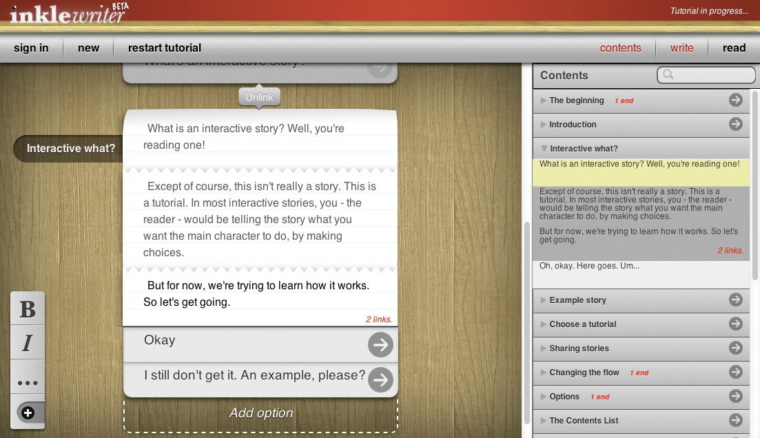
So what's new?
After over a year in shutdown mode, inklewriter has been given a new lease of life by an amazing team of open-source developers. Inklewriter is now stable on modern browsers - and it's also open-source, and of course, still free to use.
(Note, if you're interested in ink, our scripting language for IF, please check here!)
The new version is at inklewriter.com, and this is now the main branch of inklewriter. (But we'll keep the old version around for a while, to ensure you have time to copy across your story data.)
What is inklewriter?
Inklewriter is a write-as-you-play tool for creating and sharing branching stories. It aims to provide a way for anyone to start writing an interactive story, with no set-up and no barrier to getting started.
It's not as powerful as ink, our scripting language for game development - but it's fast to use, unfussy, and intuitively laid out.
It's been used by writers, game developers, schools and universities since its launch in 2012.
So what's happening?
inklewriter began as a free web project when inkle was first founded. But with web-technology always changing, it became impossible for us to maintain it.
Enter the open-source community, who have produced a full port of inklewriter to modern web-tech.
This means inklewriter is now fully stable once more, and better yet, it's going to be maintained in the foreseeable future.
The new version is available now. If you've never tried inklewriter before, you can start now. Otherwise, read on...
I had an account. What happens to my stories?
The new version of inklewriter will start afresh. That means you'll need to make a new account to start writing.
Old stories will have to be imported out of the old database and into the new one, but the process should be fast and easy. You can start importing now:
- Head to the legacy version of inklewriter (which we'll be keeping around for the time being)
- Log in, open the story you want to import, and click the share button.
- Type ".json" onto the end of the URL that it gives you, paste it into the address bar and press enter to get your data.
- Example: http://oldinklewriter.inklestudios.com/stories/musgraveritual.json
- Open in another tab the new version of inklewriter at inklewriter.com.
- You'll need to first register a new account on the new version to import your story
- Once logged in, click on the import link.
- Copy the JSON data from your story, and paste it into the text area of the import box, and click Import.
- Next click on the "open" link: your story should be here, ready to open.
We imported our Sherlock Holmes example, "The Musgrave Ritual"... and it took about ten seconds.
I've found a bug. Where can I get help?
The project is hosted on GitHub here. You can report issues - and collaborate on future development - there.
Logins and privacy
Logins to inklewriter are email addresses; these are stored in a secure database, and are never viwed / shared / sold.
If you require a higher level of privacy, however, as inklewriter is now open-source you'll be able to host your own inklewriter service, if you wish.
That said, please do not use a high-value password for your inklewriter account. Security on the internet can never be fully guaranteed.
Thank you!
We're really excited for this; inklewriter was an early experiment for us in making responsive interactive fiction accessible to anyone, without the need to be confusing.
We've frequently used inklewriter ourselves for quick prototypes and sketches, and we're over the moon that it's getting a new lease of life in the open source community.
Credits
We're enormously grateful to the team behind the project:
... and you can contact them directly.
Happy inklewriting!
Announcing... ink Jam!
Interested in ink? Been meaning to have a go at learning it, but never had the motivation? Or are you a skilled inkist, looking to show off your skills?
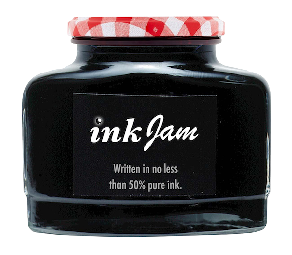
Either way, if you want a chance to take ink for a spin, we've got a great opportunity coming up. In collaboration with The Pixel Hunt, the studio behind the multi-award-winning Bury Me, My Love, we're launching ink Jam - a 3 day game jam for games made in ink.
About ink
ink is a scripting language for interactive fiction that's designed to be used by humans. Using a simple but powerful mark-up based approach, it's easy to create a branching flow that responds and shifts based on everything the player chooses. It's quick to test, redraft and restructure. But ink is also powerful, with significant features that allow for complex state-tracking world-modelling. It comes with an IDE, javascript output, and Unity integration.
It's totally free, and being used by studios all over the world to create all kinds of interactive experiences, from a news-game about Uber drivers created by British newspaper the Financial Times, an E3 favourite Neocab and an IGF finalist Where the Water Tastes Like Wine, through to a sailing qualitification course, Air New Zealand's chatbot, a game entirely written in emoji, a procedural ASCII dungeon crawler, and a celebrated globe-trotting adventure to name but a few.
How to get involved
The jam is being hosted on itch.io over the weekend of August 31st to September 3rd. Entries can be submitted via the itch jam page, and we'll be judging the results for creativity and technical wizardy.
Once the jam starts we'll be announcing a theme to help get your ideas going. Until then, if you need any inspiration, check out one of the many games written and released using ink, or visit our Patreon tips page for some of the stranger and more powerful things ink can do!

Happy New Year!
Welcome to the first post of 2018, which is going to be a huge year for us. The reason is, of course, this:
The summit is in sight...
Heaven's Vault has now been in development for over two years; and when it comes out it will be squarely three. That's as long as it took to make the entire Sorcery! series (if you take out the year we spent on 80 Days.) The result? We're thrilled - and terrified - to be nearing the end.
It's too soon to preview or dissect the game, but when we compare what we have to what we hoped we'd have, we're pretty excited. The game is an original story; with lots of incredible interactive dialogue; with interesting and rich characters; and it is beautiful.
It's that beauty that's taken so long to capture: Heaven's Vault is our first truly 3D game, and we've had to find our way around designing, creating, and lighting the varied moons of the Nebula. There are farming villages, rocky deserts, forests, ruined castles, forgotten mines, market-places and cold palaces.
To help us bring all this to life we hired two ex-Guerilla artists last year, Laura Dilloway and Piran Tremithick, who are our lead environment and lead technical artists respectively. Between them they've defined everything from the way the clouds move, to the edges of the stones underfoot and the grain on every piece of wood...
... now we must climb!
All that's left now is the climb, and it's going to be long. There's a lot of world still to realise, and to help us with that we've started the new year with a new hire - the excellent Sarah Hefford, a level designer turned artist with a flair for texturing, props and colour.

Sarah's an experienced game artist who's worked on several triple-A titles: mostly recent Killzone: Mercenary and RIGS, both of which were developed at Guerilla's now-defunct Cambridge studio; so she's been diving straight in and getting assets straight into the game.
She also marks the point where the art department officially outnumber the rest of us, five to three.
The most recent steps...
Our most recent target has been aimed at getting "coverage" - the game can now more or less be played from beginning to end, in very rough form. It means we can see how the story all hangs together and if we need to make changes, we still can - but it also means it's not ready to be shown.
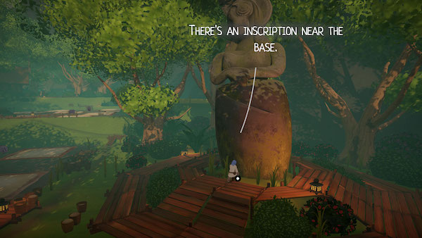
Still: there are a few screenshots out there on the Heaven's Vault page, and we'll be releasing more soon (we promise!) alongside news about our launch platforms.
... it's going to be quite a view!
That's where Heaven's Vault stands right now. We hope you're excited for the game, and are looking forward to seeing what an inkle adventure game can be. We're hoping Heaven's Vault will do for Broken Sword what Sorcery! did for, well, Sorcery!
To stay up-to-date, do follow us on Twitter, subscribe on YouTube for our latest trailers and to our dev-blog if you're more technically-minded. You can also hear our very own Joseph Humfrey discussing inkle's design and storytelling philosophy on the Art & Craft podcast.
Welcome to Heaven's Vault!
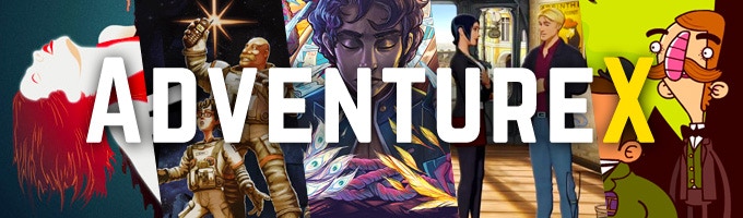
Last weekend was the return of Adventure X, London's indie adventure game festival, which has been going from strength to strength over the last five years.
While there, we checked out a lot of great games (including two ink titles, the excellent iPhone game Bury Me, My Love and gorgeous Kickstarter-in-progress Du Lac and Fey) - and we presented a talk detailing the journey so far of Heaven's Vault from concept to design.
The archaeology of an archaeological game
That talk is now up on YouTube so you can see it for yourself - no spoilers, some screenshots, and a lot of detail behind our thinking. What's good about adventure games? Why aren't archaeology stories ever about archaeology? Does The Last Express have any flaws? Why don't English people wear swords? When's the darned game going to ship?
Find out the answers to all that and more right here, and let us know what you think in the comments.